Monday 26 May 2014

Nuns

 As another more subtle twist to my project, I am going to place one final piece of work into the exhibition that wont be shown on my map. I will place it in a very subtle place that it wont easily be noticed, which will truly test if viewers have been persuaded into opening their eyes and their minds to overlooked art. Due to the very subtle nature of how it will be presented, I have made this my most controversial and shocking piece of work, greatly inspired by the Chapman brothers. 
The use of nudity and a weapon can be interpreted in many different ways depending on the perspective of the viewer, which is an effect that both Antony Gormley and the Chapman brothers utilize in their work. Both produce work with a sense of mystery and uncertainty, which I found to be very engaging and visually interesting. This is why I have tried to recreate this effect. However much like the work of the Chapman brothers, this piece of work could also be viewed and interpreted very simply: as a group of nuns just having some fun! 
Whatever the interpretation, I feel this piece of work will provoke a reaction from viewers, which is what I am aiming to do.


Another aspect that I feel makes this piece of work so important is the fact that I will be secretly placing a real intervention into my own finished project/exhibition of work. There is a sense of irony in this, as it is usually other artists intervening with an artists work. I will be intrigued as to whether people notice this intervention, and how they will react if they do. However if they don't, this wont necessarily be a bad thing. The project will retain its mysterious and undiscovered final piece, and this will reflect how not all forms of art are recognized or discovered, some will always just be overlooked.
It may also reflect how out of touch we are with the world now, maybe due to the increase in new technology. Maybe we fail to look around enough and take in and appreciate our surroundings. Maybe this is due to having our eyes glued to screens all the time. 
With all of my other pieces of work, I am preventing this from happening, as I am motivating people to open their eyes and discover overlooked art. However this piece will be the real test to whether this has worked after the trail has ended.
Whilst at the exhibition I will have to keep my eye out for anyone discovering this last piece so that I can witness their reaction.

Developing my exhibition ideas

To aid me with my leaflet design I began collecting Church leaflets that I could draw inspiration from. I collected leaflets from the Holy Trinity Church, as well as some good examples of Church leaflets that I found online. These can all be found in my research folder.

A common property I found among these leaflets was the tri-fold format, made out of a single sheet of A4 paper, which proved an effective way of presenting information. These leaflets were small enough to carry around easily, yet big enough to hold a lot of information. I found some to be crammed with a little too much text, however others included just the right balance of text, photos, and even a map. I drew inspiration from the pros of these leaflets, and learnt from the cons.
I then began designing on Microsoft Publisher. I chose this program as it allows me to set up a page in the tri-fold leaflet format and edit every aspect of the leaflet. I could apply templates, create my own templates, create a master page, insert pictures, customize the colour scheme, font, etc. Therefore I felt this would be the most effective program to use.


To create my map for viewers to follow I chose to use Photoshop. I felt this would be the most appropriate program to use due to the wide range of drawing and editing tools. Photoshop allowed me to draw out the map using various shapes, lines, and colours, adding in the finer details at the end. I could also measure out the size of my map using the grid and ruler tools to ensure it would fit into the space I left for it in my leaflet. I could have drawn out a neater coloured version of my map using pens, pencils or paint, however I felt that digitally producing the map would result in a much more polished and  professional looking outcome, which I would also be able to go back and edit if I needed to.

I decided to mark the area that each piece of work will be presented in a different coloured circle, and so once at this area the viewer will have to look around themselves for the work. By only marking a general area on the map, this makes the hunt a lot more engaging and involves the viewer in the work more. It will also allow me to slightly tweak the location of the work if I need to (such as if a problem arises and I cant place something where I originally planned, I will still be able to place it somewhere in the marked area without needing to redo the map).

Exhibition ideas

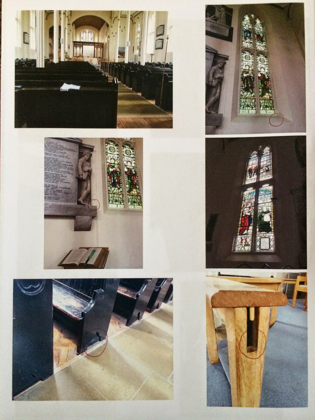
To begin planning how and where I would present my work at the exhibition, I started by visiting the Church. I spent a longer period of time there this time, trying to get a feel for the space and seek out overlooked places I could present my work. This sparked the idea that I could take the viewers on a journey similar to mine. At the start of the project it was me having to open my eyes and search for overlooked/unnoticed art. However if I were to place pieces of my work around the church in overlooked places, perhaps giving the viewer a map to follow, they could embark on their own journey to search for my intervention based art. This would then make the whole experience a lot more interesting and engaging.
Therefore I decided to map out potential areas I could place my work by drawing up a quick plan of the Church. I also photographed each potential area/object/space to help with the selection process. 
Developing my idea for presenting my work, I am going to draw this Church plan on Photoshop, and place it into a leaflet that will guide the viewers on their journey, whilst also explaining my theme, aims, influences and work. I will then present a small batch of these leaflets in my space (and so I will need to find a container/stand for them).

Plan...


Potential areas...


Exhibition aim- 
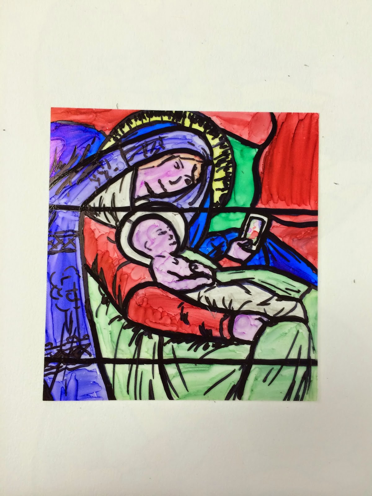
I am going to set up an engaging hunt for work, that will motivate viewers to open their eyes and discover the overlooked art that is all around them. I aim to bring them back into touch with their surroundings, much like the artist Ben Wilson does. He transforms something rejected into something beautiful, and so drawing inspiration from this I am going to turn something overlooked into something beautiful, right before the viewers eyes. This may be the overlooked bottle that is actually 'Holy Water', relaying interesting water related quotes from the bible, or it may be some of the figures, illustrating overlooked religious people and qualities they may have (such as a sense of humour!). It could be the plain looking candle that is actually illustrated with religious symbols all relating back to the church, or the stain glass window design and some of the figures that provoke us to think about how technology is a major part of our lives now and how this is effecting us. The format of this transformation (intervention) was inspired by the Chapman brothers, as I have previously mentioned. Upon visiting some of their work I found it to be intriguing, enigmatic, visually interesting, yet also aesthetically pleasing. I found the intervention aspect the most powerful, as it provoked a reaction from viewers and made them reconsider their initial judgements. This is what I am aiming to do with my work in this exhibition. I want to draw viewers in, deceive them with particular pieces of work, and make them rethink their first opinions and judgements. I hope that through my Church based interventions, including a little humour and some modern twists, I will be able to achieve this.

Through the use of my map I aim to guide the viewers on their journey, hopefully making them excited to discover the work. I want them to experience a journey searching for overlooked art much like I did, to enable them to share my experience and perhaps understand my work a little better. I hope that once they begin the journey in the same way that I did, they will start to see things how I did, however will be able to interpret these things in their own personal way. I feel this will all contribute to making the project feel a lot more welcoming and fun, which may help bring people together much like Ben Wilson aims to do.
Obstacles that I may face could be pieces of my work not being found, or being ruined. To try and avoid this I will carefully consider the placement of my work, discussing it with Justin and my class. I will ensure everything can be seen by people of any age or height, and isn't in a position where it could be accidentally damaged.

Wednesday 21 May 2014

Bible cover

Throughout making my other final pieces, I have been developing this Bible cover. This is to ensure the doodles it includes were created at different moments of creativity and boredom (and so created in the same way as regular doodles commonly are). My aim was to create a natural doodled aesthetic by doing this.

I based the doodles on anything to do with Christianity, which I researched and recorded in my research folder. I chose to use a HB and 3B pencil to ensure there was a small range of tones, and because when doodling I (and many other people) are likely to only have a pencil on them, or are likely to choose a pencil over any other material. It is the safest material to use when doodling as it can easily be rubbed out and applied in many different tones.

 
I feel the design has been successful as it appears natural and visually interesting. It includes a range of doodles, from symbols to typography to more detailed tonal drawings.
It doesn't appear to cause any offence or controversy, and so could be a more visually interesting, aesthetically pleasing, and contemporary way of presenting bibles in the future!
 

Tuesday 20 May 2014

Stained glass intervention designs

After looking around the church I noticed this on one of the windows (the writing in the bottom right). I also noticed many stained glass windows. This gave me the idea to create my own mini stained glass window (or what appeared to be), with a modern intervention.


I started by researching stained glass windows and collecting suitable photos to help me with my own designs. Once I had drawn down some ideas I began converting some of them onto acetate, using permanent marker pens as they were the most suitable way to colour the acetate. I think the one on the left is most successful as the intervention is subtle yet still noticeable. I feel the colours and lines also work better on this one.


 I next created one of my designs using Adobe Illustrator and Photoshop. I began using Illustrator, using the pen tool to draw around my scanned in design. I then imported the drawing into Photoshop, adding the outer circle using the shape tool. I could then rasterize the image, allowing me to use the paint bucket to colour it in. I chose to use accurate but saturated colours as this is what real stained glass windows commonly have. Once finished I could then flatten the image and print it onto acetate, which I will put over one of the window panels in the Church.


I like this design as it is a lot more clear and polished than the drawn out designs. The Costa cup isn't immediately noticeable however can be found quickly and easily, ensuring the viewers don't get bored searching for the intervention. I feel these designs could be seen to bridge the gap between this ancient religion and society today. By merging the old and new references (the bible scene and Costa) as well as the old and new techniques (stained glass and Photoshop/Illustrator) this creates a visually interesting and aesthetically pleasing juxtaposition, which encourages the viewers to interpret the work however they chose. This links to how the Chapman brothers juxtapose old with new (which can be seen in my analysis of their work) and also links to how the artist Antony Gormley (who I researched in my previous project) creates work which allows viewers to interpret it in their own way. Therefore both of these artists have influenced this piece of work in different ways.


Wax candle figure carving

In one of my previous experiments I carved Christian related symbols and an extract from the bible into a candle, which would then be left somewhere in the church, appearing to be a regular candle from a distance. Although this was very subtle and successful, I wanted to develop this idea and create something that had more of an impact. From this experiment I had found the wax was very easy to work with and so I therefore decided to carve a figure out of the wax.
To start me off I searched for a religious figurine to base my sculpture on, however this proved difficult to find. This is the figure I decided to use as a rough guide...

(figure image)


I started with a small but thick candle (the same as I had previously used) as I knew this would be easy to carve into. I used a wood carving knife to do this, starting from the top.

I found it very difficult to get the right shape at first, and so carved a rough figure out of the wax to begin with, going back to add more detail.


This is the figure just before it was finished. To add a modern intervention to it, I carved a small stack of magazines into the figures arms so she appeared to be holding them to her body. I then carved 'big issue' into the wax, however this wasn't noticeable so I painted it on with white paint and a very fine paintbrush, creating a big issue magazine distributor that first appears to be a religious figure.
I like the image on the left as it looks as if the figure has risen out of the flakes of wax, or the flakes have fallen away to reveal the figure. This links to the concept of miracles, which Christians commonly believe in as many are said to have taken place in the Bible.
I also find it interesting how this is still a candle, and so the figure could be melted away. But who would be melting, a religious figure that this first appears to be, or the big issue lady?
The link between these two identities is also very interesting. The first identity being the religious figure, and the second the distributor, but can these two identities be the same thing now days? Religious people are often keen to advertise their church and convert people to their religion, commonly adopting contemporary approaches such as setting up modern websites and giving out leaflets and fliers with contemporary designs. This then merges them into also being a distributer, trying to share and sell their religion and beliefs to people. Therefore this piece could question/comment on how religious people are becoming sales people.
 feel the outcome was successful as I achieved my aim. The figurative candle appears completely normal from a distance, and only when viewed up close can it be seen that it is actually a big issue lady (commonly recognised in society today). It can also have many other hidden connotations, making it all the more engaging.
Although time consuming, I found the wax very soft and easy to work with, and so with more time I would like to have been able to experiment with this further and create a range of outcomes, and perhaps a more complex one. If I were to do this again I would draw out some designs first so I could pick the most effective looking, and be fully aware of what I was going to carve before starting.


Priests lightsaber dual and Monks

To add a sense of humour to my work I decided to create two priests having a lightsaber dual. I feel this shows that despite being highly regarded, people like this can still have fun and enjoy them selves, even if in a childish manner. It is something that we wouldn't expect priests to be doing and so has a slight shock factor, along with a bit of humour to fully engage the viewers.
Previously I found that Charles Bronson and the Chapman brothers both aimed to shock viewers like this in particular pieces of their work. What differentiates the brothers from Bronson is that they use humour and connotations in their work which isn't immediately obvious, and so can often be overlooked initially. They fool the viewer, drawing them into the work, encouraging them to discard of their initial judgement on the piece and really understand what it is, the message, etc. This is the type effect that I aim to create. However this differs from Bronson's approach, which is very obvious and frank, a clear message often coming across thanks to his brutal honesty.
Bronson also sticks to two dimensional work due to this being the only materials provided for him in prison, whereas the work of the Chapman brothers is very sculptural. I have utilized both of these methods (e.g My holy water label is 2D, and my wax carving 3D) and also combined them to create work (My doodles carved into a wax candle based on 2 dimensional designs).

Creation of the priests-


To create the grey haired priest (below) I started with a figure that was in a sitting position. I cut off the legs with a  pair of scissors, before sticking them back on in a more obtuse angle from the body (so the figure appeared to be standing with bent legs/squatting).
For both of the figures I had to cut the arms off to enable me to stick them back on in a position which appeared as if they were holding something. I chose differing positions to make the dual look more life like, as if it were an action shot.
I used a piece of nickel wire to create the lightsabers.
I had to sand down the feet slightly with sand paper to ensure the figures could stand properly.
I could then paint the figures to make them look like priests, as I had done before.


 Once finished I brought the figures into my class, discovering that people found them interesting and amusing, not realising they were priests at first but finding it even more amusing when they realised. Therefore I achieved my aim and created a successful, effective piece of work that I can include in my exhibition collection.
I particularly like how strangely natural they look engaging in this dual, which I think is due to the black outfits and opposing lightsabers. However I feel the painting on these figures was slightly sloppy and the gloss finish quite uneven as I handled the figures before they had fully dried. I will have to be careful not to do this in future.

Monks...
I plan to have these monks hanging from a single piece of string, as if they are all trying to scramble up it. I will then hang the string from a pillar or the balcony.

Wednesday 14 May 2014

Minature people- developed

These are my developed figures with the modern/playful twists added...


 This is my finished Adam and Eve scene inside the mug. I placed a small Apple Mac onto Eve's lap to make the scene more contemporary, whilst playing with the pun of her being on an APPLE mac whilst Adam is about top eat the famous apple off the tree. I feel this piece has been very successful as it only appears to be a normal mug from a distance, yet on closer inspection this famous scene comes into view, appearing visually interesting, engaging, and slightly humorous. From doing this and presenting it to my class, I have found it is the slight shock factor of  the scene that initially interests the viewers, and so if I am to make more figures they need to have something unique and possibly slightly shocking about them to fully engage the viewers.


This was my next creation: A group of priests taking a selfie...


Once again I had to snap the arms off  of one of the priests and glue them back into my desired position with super glue, which is still proving an effective method. I  then researched priests and gathered a few photos to base the outfits on so they would clearly look like priests. As none of my plain figures had skirts/robes on, I had to cut a small rectangle of paper to wrap around their legs and glue down with super glue. I applied the paint more thickly around this area to ensure the paper would smoothly blend in with the rest of the figure. I used the tip of a very fine paint brush to paint on the crosses. The mobile phone was made out of a tiny cut of cardboard as I found I couldn't cut and sand a piece of plastic into shape, as it was too small. I then used super glue to stick the figures down onto a piece of acetate so they could stand upright without any support. The acetate will allow me to place the figures onto any surface, where they will appear to be freely standing on that surface as it will show through the acetate.


I next created a small group of Bishops. Once again I based them on photos I found on the internet as this was the quickest method of finding this research. This time I decided to experiment with creating a playful scene.


 I already had in mind a location for placing these figures in the church from my visit there...
(the pipe)


I aim to place the figures in a line along the pipe so they appear to be walking along it, with one bishop giving another a helping hand as you can see, and another bishop listening to his music on his headphones. The other will be walking along as normal to ensure the scene doesn't look overdone or too ridiculous, but interesting and humorous enough to draw the viewer in.
To create the bishops I once again had to create the bottom of their robes using paper (apart from on the female figure). I decided to leave the arms how they were as I felt the crossed arms created an effective tiresome, fed up aesthetic for some of the figures, particularly the bishop sat on the other bishop's shoulders. The crossed arms made him appear child-like, adding to the playful humorous appearance of the scene. To create the Bishops hats (called mitres) I used sandpaper to shape the plastic until it looked similar to the photos I had found.

After discussing these ideas with Justin I decided I am going to create more figures/scenes, but possibly based on a playful/humorous question or title (such as do priests play ping pong?) which the viewers may find amusing, or I may create a scene with more controversy within it (such as a nativity scene with two shepherds having a fight) which the viewers may find shocking or amusing. I feel this will make the work a lot more engaging and visually interesting.

Wednesday 7 May 2014

Minature People

One of my ideas included creating a miniature scene from the bible. This scene would then be placed on/in a normal object, causing it to initially be overlooked.
After carrying out research on important events from the bible, I chose to recreate the scene of Adam and Eve eating the apple from the tree, and the birth of Jesus.
 
 
I started by buying architectural scale models in two sizes- 1:150 and 1:100
I then decided to use the 1:100 scale models for my scenes as this would allow me to include more detail.
 
1:150
 
1:100


 I started with the Adam and Eve scene as this required me to break and reshape the models. I wanted the pair to be seated on the ground and so had to cut off their legs with scissors and stick them back on at a different angle using super glue. I also bent Adam's arm round so he could be holding the apple, and cut and re-glued his other arm so the pair could be sitting cosily together.

For the birth of Jesus scene I selected the figures that looked most like the characters I aimed to portray. Left to right- Joseph, Mary, 2 shepherds, 3 wise men(3 kings).
To create the shepherds I had to cut the legs off of some of the 1:150 scale models, and use them to extend the walking sticks into shepherd's staffs. I cut the bodies of some of the models I didn't need into a manger and some bushes. I used sand paper to shape the models slightly and neaten them up. I could then move on to painting the models.

 I used acrylic paints as these stuck well to the plastic and didn't flake off when dried. For extra protection and shine I used clear top coat nail varnish to cover the finished models as this was cheap, easy to use and effective. I used a very fine paint brush to paint the models. I made the top of the tree out of a ball of cotton wool rolled in acrylic paint, which dried hard.

 The 3 kings...
 
Adam and Eve, Mary and Joseph, 2 shepherds, 3 wise men...

Although it took a lot of time to shape and paint the figures, I feel this was successful. I managed to include enough detail for the figures to be fairly recognisable, yet they are small enough to be overlooked. I found the acrylic paint effective at coating the figures however some of the colours appeared lumpy and sticky. This may be due to the paint being old, dried out or cheap, and so If I were to do this again, with more money, I would buy enamel paints as they fit the purpose more and so may have been more effective.
Now that I have created the figures I am going to visit the church on a research trip to search for places I may be able to place them.
I also had the idea to place one of scenes inside a mug, which I could leave on the side somewhere in the church, which will cause the work to be overlooked initially. I will fill the mug with soil and then place the scene on top, enabling it to be easily seen when walked up to.

Taking into account my research on the Chapman brothers, I came up with the idea to place modern twists into these scenes. Therefore I am going to add in discrete interventions, such as giving one of the shepherds a mobile phone or making Adam and Eve appear to be taking a selfie. This will then keep the viewers thinking, making them engage more with the work. They will first overlook it, then realise something isn't quite right, only to realise its fine because the intervention they find is to do with Christianity and so it does after all fit in and belong in the church. However this will create a false sense of security as they will then spot the modern twist, being fooled once again, with this tiny detail perhaps causing slight controversy.
Leading on from this idea I am going to explore putting modern twists into more of my outcomes as I feel this will make the work more engaging and controversial. I may also experiment with creating more controversial scenes in other ways, such as making the characters appear to be playing childish games or fighting.

Finished nativity scene...


I really like this scene as it straight away appears to be a nativity scene, but the phone being held by the shepherd isn't noticeable at first. I feel many interpretations could be taken from this, but primarily the scene appears to juxtapose old with new, much like the Chapman brothers do. If this scene was to happen present day, it is very likely that someone would be taking photos or videos of the couple and the new-born. This has almost become a tradition of births today. Everything else that happens has small links, such as the wise men making a long journey to see the baby and bringing gifts, which still happens in a sense today as family and friends make longs journeys bringing presents for the new arrival. However technology has now injected itself into this age old tradition, and so maybe this scene is bridging the gap between old and new, contrasting them, or questioning the developments in technology, society, and life in general. On the other hand, the scene could just be viewed as humorous. I feel all of the above is what makes it a success.

Holy Water Bottle Label design

I created this design using Photoshop. I started by finding a suitable bottle label that appeared simple and had a lot of room for text (the vitamin water label). I used the same font as the original label - Helvetica Neue Condensed (light and heavy) to make the label look as real as possible.
I then blocked out all of the text I didn't want using the shape tool, along with the eyedropper tool to select the exact colour I needed and the paint bucket tool to fill the shape.
Using my research of bible extracts about water/nutrition, I inserted the most relevant extracts onto the label. I chose this subject so that the extracts on the bottle would still be relevant to the bottle, and so it would all have the same theme.
I then bought a vitamin water bottle and measured the label to ensure I could print my label to the same size. I could then stick it onto the bottle.


I feel the label is effective as it looks like a real label, and nothing out of the ordinary can be spotted on it right away. However on closer inspection the inauthenticity of it becomes clear, and it draws the viewer in making them want to read all of the text included on the label to spot every change to it. This is what I aimed to do and so the label has been a success.
If I were to do this again I would experiment with a more complex label, maybe with some imagery on it that I could manipulate. However this would have taken a lot more time and may have effected my plan/schedule.
With more time I may also have been able to make a range of these labels, perhaps all with a different Christianity related theme.
Leading on from this I am going to start making some of my other ideas so I will have a range of work, enabling me to select the most successful work for the exhibition.