Tuesday, 20 May 2014

Priests lightsaber dual and Monks

To add a sense of humour to my work I decided to create two priests having a lightsaber dual. I feel this shows that despite being highly regarded, people like this can still have fun and enjoy them selves, even if in a childish manner. It is something that we wouldn't expect priests to be doing and so has a slight shock factor, along with a bit of humour to fully engage the viewers.
Previously I found that Charles Bronson and the Chapman brothers both aimed to shock viewers like this in particular pieces of their work. What differentiates the brothers from Bronson is that they use humour and connotations in their work which isn't immediately obvious, and so can often be overlooked initially. They fool the viewer, drawing them into the work, encouraging them to discard of their initial judgement on the piece and really understand what it is, the message, etc. This is the type effect that I aim to create. However this differs from Bronson's approach, which is very obvious and frank, a clear message often coming across thanks to his brutal honesty.
Bronson also sticks to two dimensional work due to this being the only materials provided for him in prison, whereas the work of the Chapman brothers is very sculptural. I have utilized both of these methods (e.g My holy water label is 2D, and my wax carving 3D) and also combined them to create work (My doodles carved into a wax candle based on 2 dimensional designs).

Creation of the priests-


To create the grey haired priest (below) I started with a figure that was in a sitting position. I cut off the legs with a  pair of scissors, before sticking them back on in a more obtuse angle from the body (so the figure appeared to be standing with bent legs/squatting).
For both of the figures I had to cut the arms off to enable me to stick them back on in a position which appeared as if they were holding something. I chose differing positions to make the dual look more life like, as if it were an action shot.
I used a piece of nickel wire to create the lightsabers.
I had to sand down the feet slightly with sand paper to ensure the figures could stand properly.
I could then paint the figures to make them look like priests, as I had done before.


 Once finished I brought the figures into my class, discovering that people found them interesting and amusing, not realising they were priests at first but finding it even more amusing when they realised. Therefore I achieved my aim and created a successful, effective piece of work that I can include in my exhibition collection.
I particularly like how strangely natural they look engaging in this dual, which I think is due to the black outfits and opposing lightsabers. However I feel the painting on these figures was slightly sloppy and the gloss finish quite uneven as I handled the figures before they had fully dried. I will have to be careful not to do this in future.

Monks...
I plan to have these monks hanging from a single piece of string, as if they are all trying to scramble up it. I will then hang the string from a pillar or the balcony.

Wednesday, 14 May 2014

Minature people- developed

These are my developed figures with the modern/playful twists added...


 This is my finished Adam and Eve scene inside the mug. I placed a small Apple Mac onto Eve's lap to make the scene more contemporary, whilst playing with the pun of her being on an APPLE mac whilst Adam is about top eat the famous apple off the tree. I feel this piece has been very successful as it only appears to be a normal mug from a distance, yet on closer inspection this famous scene comes into view, appearing visually interesting, engaging, and slightly humorous. From doing this and presenting it to my class, I have found it is the slight shock factor of  the scene that initially interests the viewers, and so if I am to make more figures they need to have something unique and possibly slightly shocking about them to fully engage the viewers.


This was my next creation: A group of priests taking a selfie...


Once again I had to snap the arms off  of one of the priests and glue them back into my desired position with super glue, which is still proving an effective method. I  then researched priests and gathered a few photos to base the outfits on so they would clearly look like priests. As none of my plain figures had skirts/robes on, I had to cut a small rectangle of paper to wrap around their legs and glue down with super glue. I applied the paint more thickly around this area to ensure the paper would smoothly blend in with the rest of the figure. I used the tip of a very fine paint brush to paint on the crosses. The mobile phone was made out of a tiny cut of cardboard as I found I couldn't cut and sand a piece of plastic into shape, as it was too small. I then used super glue to stick the figures down onto a piece of acetate so they could stand upright without any support. The acetate will allow me to place the figures onto any surface, where they will appear to be freely standing on that surface as it will show through the acetate.


I next created a small group of Bishops. Once again I based them on photos I found on the internet as this was the quickest method of finding this research. This time I decided to experiment with creating a playful scene.


 I already had in mind a location for placing these figures in the church from my visit there...
(the pipe)


I aim to place the figures in a line along the pipe so they appear to be walking along it, with one bishop giving another a helping hand as you can see, and another bishop listening to his music on his headphones. The other will be walking along as normal to ensure the scene doesn't look overdone or too ridiculous, but interesting and humorous enough to draw the viewer in.
To create the bishops I once again had to create the bottom of their robes using paper (apart from on the female figure). I decided to leave the arms how they were as I felt the crossed arms created an effective tiresome, fed up aesthetic for some of the figures, particularly the bishop sat on the other bishop's shoulders. The crossed arms made him appear child-like, adding to the playful humorous appearance of the scene. To create the Bishops hats (called mitres) I used sandpaper to shape the plastic until it looked similar to the photos I had found.

After discussing these ideas with Justin I decided I am going to create more figures/scenes, but possibly based on a playful/humorous question or title (such as do priests play ping pong?) which the viewers may find amusing, or I may create a scene with more controversy within it (such as a nativity scene with two shepherds having a fight) which the viewers may find shocking or amusing. I feel this will make the work a lot more engaging and visually interesting.

Wednesday, 7 May 2014

Minature People

One of my ideas included creating a miniature scene from the bible. This scene would then be placed on/in a normal object, causing it to initially be overlooked.
After carrying out research on important events from the bible, I chose to recreate the scene of Adam and Eve eating the apple from the tree, and the birth of Jesus.
 
 
I started by buying architectural scale models in two sizes- 1:150 and 1:100
I then decided to use the 1:100 scale models for my scenes as this would allow me to include more detail.
 
1:150
 
1:100


 I started with the Adam and Eve scene as this required me to break and reshape the models. I wanted the pair to be seated on the ground and so had to cut off their legs with scissors and stick them back on at a different angle using super glue. I also bent Adam's arm round so he could be holding the apple, and cut and re-glued his other arm so the pair could be sitting cosily together.

For the birth of Jesus scene I selected the figures that looked most like the characters I aimed to portray. Left to right- Joseph, Mary, 2 shepherds, 3 wise men(3 kings).
To create the shepherds I had to cut the legs off of some of the 1:150 scale models, and use them to extend the walking sticks into shepherd's staffs. I cut the bodies of some of the models I didn't need into a manger and some bushes. I used sand paper to shape the models slightly and neaten them up. I could then move on to painting the models.

 I used acrylic paints as these stuck well to the plastic and didn't flake off when dried. For extra protection and shine I used clear top coat nail varnish to cover the finished models as this was cheap, easy to use and effective. I used a very fine paint brush to paint the models. I made the top of the tree out of a ball of cotton wool rolled in acrylic paint, which dried hard.

 The 3 kings...
 
Adam and Eve, Mary and Joseph, 2 shepherds, 3 wise men...

Although it took a lot of time to shape and paint the figures, I feel this was successful. I managed to include enough detail for the figures to be fairly recognisable, yet they are small enough to be overlooked. I found the acrylic paint effective at coating the figures however some of the colours appeared lumpy and sticky. This may be due to the paint being old, dried out or cheap, and so If I were to do this again, with more money, I would buy enamel paints as they fit the purpose more and so may have been more effective.
Now that I have created the figures I am going to visit the church on a research trip to search for places I may be able to place them.
I also had the idea to place one of scenes inside a mug, which I could leave on the side somewhere in the church, which will cause the work to be overlooked initially. I will fill the mug with soil and then place the scene on top, enabling it to be easily seen when walked up to.

Taking into account my research on the Chapman brothers, I came up with the idea to place modern twists into these scenes. Therefore I am going to add in discrete interventions, such as giving one of the shepherds a mobile phone or making Adam and Eve appear to be taking a selfie. This will then keep the viewers thinking, making them engage more with the work. They will first overlook it, then realise something isn't quite right, only to realise its fine because the intervention they find is to do with Christianity and so it does after all fit in and belong in the church. However this will create a false sense of security as they will then spot the modern twist, being fooled once again, with this tiny detail perhaps causing slight controversy.
Leading on from this idea I am going to explore putting modern twists into more of my outcomes as I feel this will make the work more engaging and controversial. I may also experiment with creating more controversial scenes in other ways, such as making the characters appear to be playing childish games or fighting.

Finished nativity scene...


I really like this scene as it straight away appears to be a nativity scene, but the phone being held by the shepherd isn't noticeable at first. I feel many interpretations could be taken from this, but primarily the scene appears to juxtapose old with new, much like the Chapman brothers do. If this scene was to happen present day, it is very likely that someone would be taking photos or videos of the couple and the new-born. This has almost become a tradition of births today. Everything else that happens has small links, such as the wise men making a long journey to see the baby and bringing gifts, which still happens in a sense today as family and friends make longs journeys bringing presents for the new arrival. However technology has now injected itself into this age old tradition, and so maybe this scene is bridging the gap between old and new, contrasting them, or questioning the developments in technology, society, and life in general. On the other hand, the scene could just be viewed as humorous. I feel all of the above is what makes it a success.

Holy Water Bottle Label design

I created this design using Photoshop. I started by finding a suitable bottle label that appeared simple and had a lot of room for text (the vitamin water label). I used the same font as the original label - Helvetica Neue Condensed (light and heavy) to make the label look as real as possible.
I then blocked out all of the text I didn't want using the shape tool, along with the eyedropper tool to select the exact colour I needed and the paint bucket tool to fill the shape.
Using my research of bible extracts about water/nutrition, I inserted the most relevant extracts onto the label. I chose this subject so that the extracts on the bottle would still be relevant to the bottle, and so it would all have the same theme.
I then bought a vitamin water bottle and measured the label to ensure I could print my label to the same size. I could then stick it onto the bottle.


I feel the label is effective as it looks like a real label, and nothing out of the ordinary can be spotted on it right away. However on closer inspection the inauthenticity of it becomes clear, and it draws the viewer in making them want to read all of the text included on the label to spot every change to it. This is what I aimed to do and so the label has been a success.
If I were to do this again I would experiment with a more complex label, maybe with some imagery on it that I could manipulate. However this would have taken a lot more time and may have effected my plan/schedule.
With more time I may also have been able to make a range of these labels, perhaps all with a different Christianity related theme.
Leading on from this I am going to start making some of my other ideas so I will have a range of work, enabling me to select the most successful work for the exhibition.

Thursday, 1 May 2014

Photoshop: Photo Collection Stencil

Now that I have collected a large number of primary research photos on overlooked/unnoticed art, I decided to present them in an engaging way using Photoshop. 


I first imported all of my photos into the program, using the free transform tool to line them up against the grid (which I selected by going on view - show - grid) ensuring they were all the same size and rotated to be landscape. This then formed a grid of photos that I could use as a background.


Next I created a stencil using the quote- Inspiration comes from everywhere, its what you do with it that counts. I chose this quote as I feel it links to the recognition and use of overlooked art that I have showed throughout my work.
To create the stencil I first used the marquee select tool, creating a large box the size of the page (A4). I used the paint bucket tool to fill it with my selected colour. 
I next created a new layer in which I used the text tool to type out my quote and select a clear bold font. Once I had done this, I used the magic wand tool whilst holding shift to select each of the individual letters. Once all selected I clicked onto the layer that the box I previously made was in. I then went to edit - cut, which cut the letter shapes out of the box. I could then delete the layer that had the text in. Now that the letters were cut out of the box, the background of my photos that I made earlier could be seen through.


I feel this was successful as I effectively presented my photos collected to date in a visually interesting way. Instead of just reading the quote, the viewer is pulled in by the background of photos showing through, wanting to explore these forms of art that would normally be overlooked.

Wednesday, 30 April 2014

The Chapman Brothers

After a visit to Tate Britain I became interested in the controversial work of the Chapman Brothers: Jake and Dinos Chapman. I feel I can draw a lot of inspiration from their work for my current project as both mine and their work has links with intervention and merging old with new. Therefore I decided to research their work in more depth.

The Chapman Brother Family Collection (Tate Britain)...


 My own photos of two particular pieces that I liked...


I found their work fascinating as when I first entered the dark room, I was met by an assemblage of illuminated pseudo-African totems, masks and carvings. However upon closer inspection the inauthenticity of the objects gradually became apparent, with the distinct identity of the fast food chain McDonalds emerging as a key theme among the work. 
The brothers have reconciled ethnographic art and fused it with modernism, the result being a timeless collection of work that speaks a universal language, bringing global culture together.
The juxtaposition between the ancient aesthetic of the sculptures yet the modern fast food brand really drew me in and has influenced my work on this project, inspiring me to explore mixing historical work with contemporary themes, which can be seen in my cave drawing experiments in which I converted modern scenes and brands into cave drawings.
This style of juxtaposition can communicate different messages to different people, which is something I have found intriguing throughout every project I have completed. However what I find most intriguing about the work is how it willfully resists straightforward interpretation, fooling the viewer to begin with before forcing them to reconsider their first interpretation and judgement of the work. However a straightforward explanation is very hard to find.

Even the sources of these supposed treasures are in place to fool the viewer, with the named sources Cambig, Seirf, and Ekoc revealing much more when read backwards! 

However despite all of the simplistic Mcdonalds references, the brothers have skillfully made cultural trespass the broader issue addressed here, making overt references to the history of modern art ( e.g. minature version of Endless Column by Constantin Brancusi with a red haired mask). The work also comments on how museums drain the sociological and religious meanings from ethnographic artifacts, instead focusing on presenting them as aesthetic objects. This makes me wonder whether the main focus of museums/galleries has become the aesthetic of a piece of work? Have the brothers placed an extremely popular brand on traditionally meaningful objects just to satisfy the public? Or by doing this are they proving that people are mainly drawn in by aesthetic at this current time, which makes the meaning behind these ethnographic objects pointless?

Once I had viewed a couple of the figures, I found that I wanted to explore the whole collection, searching for the clever trickery and hidden Mcdonalds references. The technique of creating discrete references for viewers to search for is very effective as it encourages the viewer to really engage with the work and explore it in much more detail. I would like to explore using this technique in the Church with my own work, maybe by presenting the viewers with a map instructing them to find my work and explore what it portrays/connotes for themselves. This will make the work interactive and engaging for the viewers, like the Chapman brothers' work.


I particularly like this piece of work due to the juxtaposition between the pseudo African sculpture and the very modern items it is holding. I feel it portrays how the extremely popular fast food chain has now infiltrated the most remote corners of the Earth, and so it could be suggesting how this is ruining traditional cultures and damaging these places (through deforestation, colonialism, capitalism etc.) This led me to think about how we overlook these problems when we think about the fast food chain. The common negative thought is on the subject of health: how bad the food is for us. Yet many of us never spare a thought for the real problems caused by the chain, we simply overlook these problems. Maybe the work was made to encourage us to think about this?
Yet despite all of this the beauty of the work remains intact and infectious, which is what appeals to people. 


No critique or political statement is offered by the brothers, however it has been said that their aim is to unearth the contradictions and hypocrisies present in contemporary culture, posing questions but providing no answers (source can be found in my research folder). This sense of mystery that leaves the viewer to interpret the work in their own way is very interesting to me, and is also what Antony Gormley aimed to do in some of his work, although he achieved this by creating work that could be viewed differently depending on a range of factors. I am hoping to create work that achieves this effect as I feel it helps the viewer engage with the work and make personal links with it.

The brothers mentioned in an interview (found in my research folder) that 'The effect is more interesting than the object'. This suggests they aim to provoke a reaction, which could actually be more important than the artwork itself. This is something I am going to explore with my intervention work. With some pieces I may aim to create something that provokes a reaction from the viewers, maybe just the shock that the item isn't first what it appeared to be, or possibly something more shocking. This will hopefully make my work a lot more engaging.
This effect also makes the Chapman Brothers' work similar to the work of Charles Bronson, as he also aimed to provoke a reaction with his work. However the methods used are very contrasting; Bronson opted for a very straightforward, brutally honest approach; whereas the Chapman brothers provoke a reaction through confusion, and the possible suggestions of their work, but nothing is certain like it is in Bronson's work. I feel the discrete method of the Chapman brothers will be most effective in my work as I need to consider the environment in which I will be displaying my work- The church, and so I feel that shocking and controversial work like Bronson's may not be appropriate here.


Leading on from this I aim to create site specific work for the Church (in which our exhibition is being held) that will hopefully deceive viewers when they first view the work, with the intervention/manipulation gradually becoming clear under further inspection. I am also going to explore giving my interventions more modern twists like the Chapman brothers do as this causes controversy and excitement.
I may also consider displaying some of my work on shelves or plinths as the Chapman brothers have, as it highlights the objects as pieces of art without revealing their inauthenticity right away, and so this is something I will need to explore.


Sunday, 27 April 2014

Intervention scenes experiment

Leading on from the last experiment I wanted to explore creating a scene containing an almost unnoticeable intervention. I focused on a normal household room- the kitchen.
To aid me with my work, I used a regular overlooked object from the kitchen- cling film.
Using acrylic paint I painted overlooked artwork (from my primary research) onto the cling film. This enabled me to stick the cling film onto objects, with the paint appearing to be directly on the object. I used acrylic paint as I knew from experience that it would successfully stick to the cling film, whereas other paints wouldn't. I also knew that permanent markers would be successful, however these would be too bright and vivid, whereas with the paint I could create more accurate colours and a greater range of colours.
Once painted, I stuck the cling film to various places within the kitchen and photographed the scene.


I feel this has been successful as you have to search the photo for the intervention, however it doesn't take too long to find. When viewing the photo without being aware there is a hidden piece of artwork within it, it is almost unnoticeable, with the scene appearing normal. Therefore I feel I have achieved my aim.
If I were to do this experiment again I would create a larger number of interventions and select the most successful ones. With more time I could do this, and print out the scenes as a piece of work. Another route I could explore is to place interventions in public places (without causing any damage), and maybe explore whether people notice them/how they react.

Plant experiment


For this experiment I focused on manipulating something natural (a plant), as I think viewers would least expect to find an intervention on a natural object. I selected one of my primary research photos that  I felt was a successful piece of overlooked art with a natural aesthetic, and so therefore would fit in with the plant.
I carefully removed a leaf from the plant and carved the selected drawing out of it using a scalpel. This was an effective piece of equipment to use as it cleanly and easily cut through the leaf, and so made the process a lot quicker.
I then placed the leaf back into the plant pot in a position in which it appeared natural, as if it had never been removed.


What I find interesting about this piece is that it is quite hard to notice the intervention at first without looking at the plant properly, however as the damaged leaf inevitably dies, it changes colour and begins to stand out, gradually drawing increased attention to the intervention.
This could also connote a comment on how public artwork often causes damage. Here the leaf has been damaged by the artwork (as it has been removed from the plant and then carved into). This relates to how public artwork can damage its surroundings and the environment. Examples of this are graffiti on walls, bus stops, doodles on windows, tables, chairs. The product can be skilful and aesthetically pleasing however damage may have been caused to these 'canvases' (objects). Is this right?

Thursday, 24 April 2014

Stones Intervention Experiment

Leading on from my cave drawing experiment I wanted to explore and develop the technique of intervention. I aimed to create work that would make the viewer look twice at it; overlooking it at first but then realising that something isn't quite right.
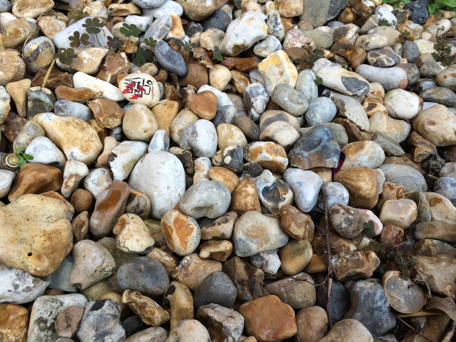
I started with the simple idea of taking a stone, modifying it using my primary research photos, and then placing it back where I found it. At a quick glance the modified stones were quite unnoticeable. However on more careful observation they stood out against the regular stones surrounding them. 
I find this concept very intriguing and so will develop it further. I will do this by conducting more experiments, perhaps experimenting with the subject matter, style of intervention, or the environment in which I conduct the experiments.

I used a range of techniques to decorate the stones so that I could explore which proved most effective.


I started by using a 5B pencil. This was soft enough to be noticeable on the stone, however at certain angles the pencil drawing reflected the light preventing the drawing from being noticeable. This could be viewed as a pro or con. If I wanted to create an intervention that was bold and always noticeable when viewed closely enough then the pencil wouldn't be an effective material. However if I wanted the stone to blend in more and not always be noticeable then the pencil would prove an effective material. 


I next used a black permanent marker pen. This proved bolder than the pencil however when placed amongst the stones, blended in effectively. This could be due to the simplicity of the design, as a complex design may have appeared a lot more bold and prominent. Although bold, the black pen still appeared quite natural among the stones.


Leading on from the black pen I used coloured permanent marker pens. These created dynamic, eye catching, bold drawings that appeared a lot more artificial than the pencil and black pen drawings. If I wanted my intervention to be fairly quick and easy to find, this would be an effective material to use.


Lastly I experimented with acrylic paint. I chose acrylic as I knew this would be the most effective paint I had available to me at sticking to the stone (watercolour paint may have run off). The red paint, similar to the coloured marker pens, dried bold and eye catching, yet harboured a more natural appearance than the pens. This would be an effective material to use if I were aiming to create a colourful yet natural aesthetic for the stone.

I feel this was a successful experiment as I gained knowledge on the best materials to use for this type of intervention, and produced effective intervention based work. I think it was effective as it was only noticeable when looked at closely, which was my aim. 
I could develop this idea further, perhaps buying a plant in a pot that has stones in, and placing a small modified stone in this. I could also transfer the idea into other areas, perhaps intervening with nature, everyday scenes, public places, etc.

If I had more time I would take a collection of modified stones and shells to the beach, recording the reactions of the public, and exploring the types of people that noticed the artwork, what they did with it, how they reacted, etc.